// BarryBlog //

A creative dumping ground for issues that interest me personally and professionally, with the thought they may interest you too. Issues such as the business of design, the design of business, the design of objects, design strategy, creative direction, innovation, creativity, thought leadership, observations, as well as recommendations, mid-century modern decorative arts and architecture, and the state of my thinking (and currently the state of my heart).

Wednesday, November 29, 2006

Pagebull: Visual Search Engine


Like Google and Yahoo, Pagebull is another internet search engine. But what makes Pagebull special are the results, which are presented visually in the form of web screenshots. Using Pagebull, you can see your results visually before visiting each resulting link, which is a time saver. Visual search results may in fact open up doors creatively based on the ability to explore more than if you just got text results. Though similar to an RSS syndicator in that sense, Pagebull is accessible on any computer with a web browser. I use (and love) a paid program called NewsFire to do almost the same thing, but it's a third party application which is only accessible on my machine in one location. There's something cool about being able to preview your search results on the fly and before commiting to a click. I wish the crew at Pagebull well.

NOTICE TO PAGEBULL STAFF: If you eventually sell for $1.4 billion to Google, please remember I blogged you when you were a nobody, so throw me a bone!
Penguin Innovation: Books by the Greats, Covers by You


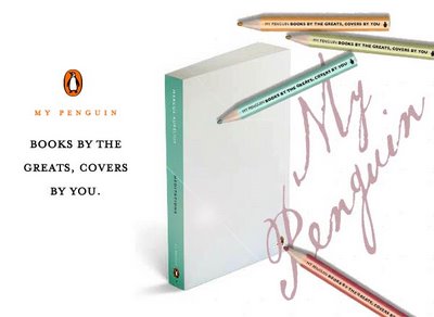
According to consumer research on what factors matter most when deciding whether or not to pick up a book in a bookshop, people claim cover design is most important.

Despite these findings, publisher Penguin Books has decided to publish six top classics with blank covers under the name “My Penguin.” Each cover is made of art-quality paper that receives ink, paint, pencil and glue, and each comes shrink-wrapped to keep the cover from getting dirty. In conjunction with this effort, Penguin has launched a companion gallery website that encourages end users to submit their artwork for all to see.

Tuesday, November 28, 2006

10 Faces of Innovation


In an exclusive excerpt, we’re introduced to the 10 personality types required to keep creativity thriving in an organization--and the devil’s advocate at bay.
Ideo’s Tom Kelley describes how in an environment of design innovation, the devil’s advocate may never go away, but on a good day, these 10 personas can keep him in his place...or tell him to go to hell.

An insightful article by an insightful man regarding how to deal with certain people in an organization more proned to subtracting than adding. I Highly recommend the book.

“...this book delivers some tasty morsels to managers hungry to boost their companies' level of innovation. It is funny, insightful, and chock-full of surprising examples. If you take it on a flight from Los Angeles, you will have something to use at work by the time you land in New York.”—Bruce Nussbaum, BusinessWeek
( via fastcompany )

Thursday, November 23, 2006

Happy Thanksgiving


“O God, when I have food, help me to remember the hungry; When I have work, help me to remember the jobless; When I have a home, help me to remember those who have no home at all; When I am without pain, help me to remember those who suffer, And remembering, help me to destroy my complacency; bestir my compassion, and be concerned enough to help; By word and deed, those who cry out for what we take for granted. Amen.”
— Samuel F. Pugh

Wednesday, November 22, 2006

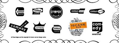
REPOST // Werner's Wonderful Werk


Originally posted September 14: Back in WWII (actually, it was the late 80's), when I was a young designer, I followed the work of the Duffy Design Group. They produced outstanding design, but always struck me as weird that an annual report for a healthcare company could look exactly the same as one for a financial institution. Since that time I've tried very hard not to limit my design solutions to a specific "style."

Well, 20 years have passed, and the rest is history. Duffy & Partners are a mega successful, legendary design powerhouse, and well, I'm not.

I digress.
A designer who cut her teeth at Duffy has gone on to a long and celebrated career, and is now considered amongst the best in the biz. Many of you reading this are well aware of her high profile work, but for those of you who aren't, her name is Sharon Werner. Her site, WernerDesignWerks, is testomony to a wonderful, enviable design career full of top notch work. I really admire her thinking. And her approach. And her client list. You will too.

Tuesday, November 21, 2006

Information Age to Recommendation Age


An interesting article by Frog Design's Strategy Director Adam Richardson who believes we’ve transitioned from the Information Age to the Recommendation Age.
Previously the challenge was obtaining information. Today, with way more information than one knows to do with, recommendations have become the currency. The key to recommendation is trustworthiness. Track record, perceived objectivity and competence of the source are paramount. Go to article.

Michael Bierut - 3 Part Interview

Adaptive Path has interviewed graphic designer and Pentagram partner Michael Beirut in 3 installments. Like everything Adaptive Path does, this interview is outstanding. Every time I read anything about Michael Bierut, I learn a ton. If you want to read a great interview of one of the best design thinkers living, check these out.
No. 1 No. 2 No. 3

( via Adaptive Path
blog )

Saturday, November 18, 2006

Nike+ and the Holidays


Okay, it’s official. The holiday treats in my office started rolling in. For reference, this represents fine Belgium chocolates (Linda!), hot apple cider (Doug!), and a plethora of other delicious and not-so-nutritious goodies. So, as I ponder my strategy for jacking up the discipline a notch, I spent some time on the Nike+ site to see what all this health crap is all about. With 20 pounds to negotiate, I’m thinking this might be an option. My current running shoes are not that used, but the years they’ve been on ice makes them look and feel a bit crusty. And since the Nike+ site opened my eyes to current styles (and prices...Yikes), I'm afraid running in my Nike Max shoes may be the equivalent of playing tennis with a woody Jack Kramer.

So as for this Nike+ thing—for it to work, you must own a iPod Nano, a $100 Nike+ shoe, a transmitter card to fit in your shoe, and then of course iTunes to monitor your progress. The Nike+ site has a great video explaning this all in the "Support" area. Since the site is all flash, I have no way of posting specific links. So have at it.

All Types of Cars


CarType examines the typography used in cars, among others things. Updated daily. Developed by Chicago’s legendary Segura - aka T26; aka 5inch; aka Segura, Inc.

( via my comrade, Deano )

Friday, November 17, 2006

It’s all about choices. Choose your "C."

Everyday, life is full of choices. Some choices are simple (what to wear). Some choices are harder (should we break up). And some choices are huge (what am I passionate about and what do I want to do with my life.) One thing is certain. Every choice you make defines you. Own your choice.

Own Your “C.”

The “Own Your C” youth tobacco prevention and cessation media campaign is sponsored by The State Tobacco Education and Prevention Partnership of the Colorado Department of Public Health and Environment and is funded with proceeds from the 2004 state tobacco excise tax.

Thursday, November 16, 2006

Clip/Stamp/Fold - Architectural Magazines


An amazing collection of architectural magazines, The Clip/Stamp/Fold gallery includes pamphlets, building instruction manuals along with professional magazines, which collectively serve to document a key period of architectural innovation; challengeing today's architects to provoke a similar intensity; and aiming to invite reflection on contemporary uses of media in architecture.
( via Stealing Beauty )

Wednesday, November 15, 2006

Football’s Ferguson. Design’s Bierut. See A Thread?

Do you see what I’m getting at? Being interested in stuff matters. And it keeps on mattering even when you’re as successful as Ferguson. Knowing your industry, being really, genuinely passionate about your industry matters. It really matters. Both these men are senior in their fields. Both of them have achieved enough to sit back and take the plaudits. Both don’t do that. Both of them have a passion for their work. Do you think it’s a coincidence they’re both still successful?
What threads can be found and conclusions drawn by comparing a UK football player/coach and a US communication designer—both who are at the top of their game? I recommend you read this article to find out (as well as any post by the two resources below).

( via a russell davies post; via NoisyDecentGraphics )

Dinner In The Sky...I Ask: Why?

As a creative professional, nonsensical ideas are never far at hand. Difference is I don’t pursue them all. I'm sorry...this is stupid.

Notes: What to do with the pack of stray dogs looking for table scraps? Real steak knives or plastic? And what’s with the menu? Looks like little cheese blocks with parsley on top. If I’m gonna get crain hoisted that high and forced to wear a funny chef hat, we better be talkin' surf and turf.

Monday, November 13, 2006

Blogger - Blogspot Woes: Lessons I’ve Learned

Sunday evening, November 12th, I decided to migrate //BarryBlog// from my blogspot Blogger platform to the Blogger BETA platform. I was invited to update six or eight weeks ago by Google/Blogger, who is offering this optional upgrade in phases.

Well, after going through a relatively simple transaction, I hit the “upgrade” button.
I liken clicking this button to a time travel machine stuck in reverse, which in the end traveled back to the first day I ever posted. Translation: my blog vanished!

It remained M.I.A. for the remainder of Sunday, until just now.
I followed the directions Blogger’s auto-reply sent me several times, then sifted through the Blogger help site and found the email for support. Three emails, and four chat sessions later, I’m now back in business.

Some of what I gleaned as a result of this bumpy ride: Blogger is a company which handles an enormous amount of traffic, and is sent a plethora of calls for help, such as mine (J knows what I'm talking about). And as I found out this evening, they are subjected to the worst in people. People who have lost not only their blog, but their mind in the process, and who type words which are downright mean. The support staff is overwhelmed and overworked. I bet you can’t relate with that in your job, right?! Well, truth is, Blogger is struggling—experiencing significant difficulties and downtime. Though I'm convinced by my experience that they’re really trying. And last, if they ever do intend to charge premiums for their services, they have much ground to cover in order for that to seem like a business value.

In conclusion: I check this off as another great lesson in what it is to be a blogger in what seems like the wild west. In the end I am grateful to those in my google support group who came to my defense and got the Blogger Buzz support team to respond to, and in the end rectify my situation. Life continues. And so does this blog.

( special thanks to Rat and SwtRose for coming to my rescue )

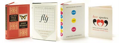
Designer Roberto de Vicq de Cumptich


Roberto is a great designer and thinker. His book covers inspire me.

( via outerwearforbooks )

Assaf.co.uk Rocks


Speechless. You have no idea how these two gents can kick it. Check out the videos on the site.

Friday, November 10, 2006

Genius Flickr Search Tool


For all you Flickr fans, I've posted Flickr search apps before, but this one’s special. It works like my brain does...in a more general context. I’ve found it extremly intuitive to use and quite helpful as I browse for ideas and inspiration. Try it out yourself, I think you'll love it!

( via brand new )

Illustrator Benjamin Wachenje


Powerful. Simple. Distinctive.

Tuesday, November 07, 2006

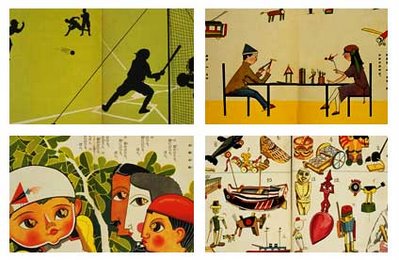
Kodomo no kuni: Arts. Education. Inspiration.

The Kodomo no kuni chronicles a variety of creative forces behind urban Japanese culture in the 1920’s—led by believers that art held an important role in the education of children. Beginning in 1922, the Kodomo no kuni was a tangible attempt to market a commercial journal to the general public to present this high-minded perspective and enlightened ideal of preschool education through the arts. The Picture Book Gallery No. 2 Exhibit centers around some 300 illustrations published in the Kodomo no kuni picture book magazine during the first decade after its inauguration in 1922. The images in Kodomo no kuni depicting the children in the latest fashions reflected a mingling of reality with dreams and aspirations. At that time, advances in mechanical technology were reflected in the daily life of urban society. A major theme of children's picture books around the world was technology, at a time when technology was seen as holding out the promise of future happiness. One of the newest themes for illustrations in Kodomo no kuni, too, was the affluence and comforts provided by machines. This exhibit presents the melodies for ten children’s songs (which you can listen to on the site) and the lyrics for thirty in chronological order—both audio and visual. Nine stories by Kishibe Fukuo and one each by Hamada Kosuke and Ogawa Mimei are available in audio form. The commentary section is designed to visually demonstrate, mainly through the Kodomo no kuni, how Japan was linked to the world in every aspect of people’s lives. It also exhibits all the pages of two issues of the magazine to show the editorial presentation of a picture magazine in those days.

More about Kodomo no kuni here.
designwire

Soundtrack to the 50’s American Design Stylist


Try and imagine this over the top retrospective on 1950’s automotive design narrative without the overly dramatic soundtrack, and imagine instead a Moby-inspired soundtrack. I believe the soundtrack they used was left over from the Sound of Music. Yikes! Painful. The video is a classic, and a great find. Also way pre-casual Friday. Man, they’re donning the suit and tie while they’re working in clay all day. And when did that manager smokin' a pipe thing go out of style. Can you say three martini lunches?

( via Russell Davies )

Innovative Illustrator: Tim Biskup

Tim Biskup’s is an amazing illustrator. His style is inspired by mid-century modern design—but executed with a punk rock twist. He’s highly prolific, producing limited edition prints, clothing, toys, books, publications, hand painted objects, books, cards, etc. His original paintings and sculptures are highly sought after as well. His Bispop Gallery, in the center of Old Town Pasadena, exhibits and sells original paintings, and store exclusive items. For more information about Bispop Gallery, visit www.Bispop.com.

Monday, November 06, 2006

The Legendary frog

Legendary multi-discipline design firm frog design has launched its first bimonthly newsletter, frog Design Mind which includes articles from top strategists, designers, and marketers on the latest developments in their fields. I also found this timeline to be a great way to catch up on all things frog.


Friday, November 03, 2006

MetroFarm: Just Two People?


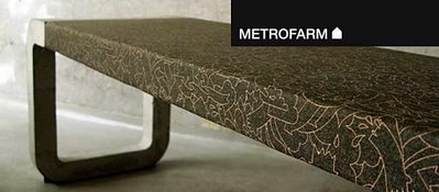
I was initially attracted to Metrofarm because of their incredible furniture which I had seen on various sites, including designspotter. However after checking their site out, I have even a greater appreciation for their abilities. In addition to furniture design, they are also gifted designers of objects and graphics. To top this all off, the entire breadth of work is that of just two people. Julia on graphics and Nunu on design. In addition to “things,” their clients call on them for concept and strategy, curatorship and production.

I just wish I could afford their benches. And hey, since today’s my birthday—why not buy me a couple! Or, might I suggest this again?

Cool Java Script Trick

1. Copy this code:

javascript:R=0; x1=.1; y1=.05; x2=.25; y2=.24; x3=1.6; y3=.24; x4=300; y4=200; x5=300; y5=200; DI=document.getElementsByTagName("img"); DIL=DI.length; function A(){for(i=0; i-DIL; i++){DIS=DI[ i ].style; DIS.position='absolute'; DIS.left=(Math.sin(R*x1+i*x2+x3)*x4+x5)+"px"; DIS.top=(Math.cos(R*y1+i*y2+y3)*y4+y5)+"px"}R++}setInterval('A()',5); void(0);

1. Go to this page, and once the page loads completely, paste the code you just copied into the address bar and hit return.

Note: This works for any page that has images.

( via supremetalk )

Thursday, November 02, 2006

DSFonts. One-man type factory!

Dino dos Santos Fonts— the Portugese typographer extroirdinaire. Check out his modern serif, sans-serif, and script fonts, plus view his commisioned projects.

( via digitalthread )

Wednesday, November 01, 2006

Bestsellers: A Short Lived Existence

The life-expectancy of a bestselling novel has been cut in half in the last decade.
Read on...

( via Michael Hyatt's suspended in time blog: From Where I Sit )

Ray Fenwick: Illustrator, Artist, Letterer


I love Ray Fenwick’s work. Above is his Flickr set called “Hall of Best Knowledge.” He describes this body of work as combining lush imagery with lucid prose—imagine the works of Chaucer projected on the ceiling of the Sistine Chapel. Check out his site for more.


( via CrapDetector )

Newer Posts Older Posts