This is not your father’s Audimobile
So you bought the Audi Q7, and you're looking to disguise it as a mid level GM vehicle? Today's your lucky day!
...reminds me of...
Labels: Design
A creative dumping ground for issues that interest me personally and professionally, with the thought they may interest you too. Issues such as the business of design, the design of business, the design of objects, design strategy, creative direction, innovation, creativity, thought leadership, observations, as well as recommendations, mid-century modern decorative arts and architecture, and the state of my thinking (and currently the state of my heart).
So you bought the Audi Q7, and you're looking to disguise it as a mid level GM vehicle? Today's your lucky day!
...reminds me of...
Labels: Design

Unless you’ve been living in Kuala Lampur, you know the Hispanic market has enjoyed a boom over the past few years. Clients are familiar with the research and charts all showing the growth in purchase power over the next few years coming from the Hispanic market, so most are interested in buying into this “new trend” which has been happening for the past 20+ years.
So a Puertorican, Cuban, Colombian, Argentine walk into a bar. Nope, this isn’t some cheap, tasteless joke about our newfound multiculturalism. It’s everyday at one of the top Hispanic agencies in the US.
(FULL STORY)
José Reyes is partner and creative director at Turbulence, an award-winning creative shop in Miami focused on revitalizing brands by building culture not just advertising.
( via ihaveanidea.org )
Labels: advertising, Brand, culture, Design, hispanic marketing, Jose Reyes, research, Turbulence

The Pilsner Urquell International Photography Awards Competition is the world’s most prestigious photography contest for both professional and amateur photographers. Enter Advertising, Architecture, Book, Editorial, Fine Art, Nature, People and Special categories for your chance to win the coveted title of International Photographer of the Year and the $10,000 cash prize today.
Labels: Design

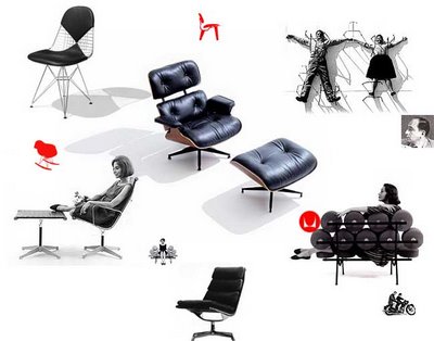
The great practitioners of modern design in America instinctively knew the answer. Herman Miller would like to explore this idea with you. Meet the designers, learn about their world and their work. Like anything from Herman Miller, this site is valuable.
herman miller discovering design
Labels: Design
 Ten Ways to Build Passion
10. See greatness in those around you and share your vision
9. Express constructive feedback in terms of "the vision"
8. Believe that things can be different and approach the improbable with optimism
7. Set high standards for performance and hold EVERYONE accountable
6. Demonstrate courage, judgement, risk-taking and continuous improvement in your own performance
5. Recognize and celebrate success
4. Design growth experiences that stretch but don't break people
3. Invest in trust and even love
2. Respond maturely to failures and setbacks
1. Push power and decision making down“High performers drive you nuts sometimes. You need to enjoy that. Steer them, frame their objectives, but don’t repress them.”
--Terry Leclair, Senior PD Director at Intuit
“High performers are like ‘thoroughbreds’. They require lots of care and feeding - but boy can they run.”
-- Tobey Corey, Founder US Web
“As a leader you have the obligation to define the ‘what’ to the Nth level - to get to goals for the right level - to make sure the ‘what’ is right. But you don't want to dictate the ‘how’. You want to give the team and the individual the determination of ‘how’.”
-- Pankaj Shukla, VP, Quickbooks PD at Intuit
Eight Ways to Wipe Out High Performers
1. Work overload
2. Lack autonomy (micromanagement)
3. Skimpy rewards
4. Loss of connection
5. Unfairness
6. Value conflicts
7. Let low-performers ride
8. Create an environment of fear, uncertainty and doubt
- -
A video on the subject of top performers and leadership
If you’re one of my immediate colleagues, this may not play nice with our proxy.
( via creativegeneralist )
Labels: Design
 Hilarious, really. A post about “get-aways” from a person who barely ever takes a break. But...This website blows my mind. If it loads slow, know it’s worth the wait. If not for just the music.
Ben Folds, Persephone's Bees, James Blount, Vassey, etc.
NICE!

These letters speak for themselves.
( via BagOfNothing.com )
Labels: bagofnothing, Faith, god, Letters
 Trends, the future, innovation, creativity -- that's the focus of internationally recognized futurist Jim Carroll. Jim believes it’s a great time to adopt ideas to get your company out of a complacency- funk and into an innovation- mindset. One that will help you turn change into opportunity.
A 10-Step program.
( via jimcarroll.com )

Mike’s got his own Coke commercial. Big skills.
( via LOUNGE72™ )
Labels: Design

Companies who’s boardroom understands the tangible value of design and brand also understand creativity and innovation requires a unique blend of work and play. And only a few companies in the world are as successful in these regards as Apple. Jonathan Ive, Apple’s creative thought leader and senior vice president of product design, leads a team with the utmost respect and concern for the design process. Here’s a rare glimpse into Apple’s design and innovation process under Ive’s stellar leadership.
Still Interested? Then check out...
More lessons on Design Innovation
BusinessWeek Innovation
( thanks Chris A )
Labels: Design

An e-magazine dedicated to people interested in great design. All products meet at least two of the three criteria:
1. Must be available to purchase online.
2. Is well designed and has a useful purpose.
3. Is made using recyclable/sustainable materials or otherwise environmentally sound
Honestly, a bunch of stuff you don't need.
Labels: Design

Though the name might throw you, if you’re involved in ANY way (however remotely) in serving the design, marketing or general communication needs of a ministry, I guaranteed this site will suck - (hours of your time that is)! According to the website, it’s intention is to “frustrate, educate and motivate the church to communicate” - simply put, to help the church matter. I care about the latter part of that statement, which is why I thought you too might be interested in checking out this site.
If you go quickly through the site you won’t appreciate it. The concept is very intentional. Here’s insight into why they chose to use the “S” word. They’ve provided an alternative link with a different name in case the word troubles you.
The Apple iPod’s relaunched. And though I’m one of the last 10,000 holdouts in the United States without one, I do have the Motorola ROKR. Contrary to the millions of negative reviews, this is a very nice phone/MP3 combo device. I’ve enjoyed it.
...with the introduction of their K5 mp3 player. Looks pretty nice (and would share quite nicely into my Christmas stocking!).But “music’s meant to be shared” says Samsung...

Perhaps you’re aware of this, but I’m new at this blogging thing. And each time I consider adding a new post, a few key questions come to mind.Questions like, “Since I find this interesting and/or helpful, will others?” Or, “Is what I"m about to publish something only I have never seen before?” Or, “Where in the world-wide-web did I mine this nugget of goodness?” Further...“If I can't remember who I got it from, or if I miss associate it, will I bum someone out?”
To blog is to best check your ego at the door. Blogging is pretty much an open book in these regards. So should I post something crappy, old, or from your blog without giving you credit, I ask for grace. After all, you get what you pay for, right? As of today, no big checks have graced my mailbox!

“share prices of companies which invest in design performed up to three times better”
Great companies place high value on design, giving them a competitive “leg up” in their markets. Design allows companies to improve innovation, productivity, create consistent and favorable brand impressions, and numerous other tangible advantages. In turn, design tangibly impacts their companies' bottom line.
In the Design Index by DesignCouncil (the Canadian equivalent to our own AIGA, for which I'm a member) – statistics prove out this point again and again. I recommend the DesignCouncil site to all my colleagues. It's a treasure trove of insight, rationale, research and inspiration. It's the type of site you might even suggest to your customers. Or potential customers.

Labels: Design
Back in WWII (actually, it was the late 80's), when I was a young designer, I followed the work of the Duffy Design Group. They produced outstanding design, but always struck me as weird that an annual report for a healthcare company could look exactly the same as one for a financial institution. Since that time I've tried very hard not to limit my design solutions to a specific "style."
Well, 20 years have passed, and the rest is history. Duffy & Partners are a mega successful, legendary design powerhouse, and well, I'm not.I digress.
A designer who cut her teeth at Duffy has gone on to a long and celebrated career, and is now considered amongst the best in the biz. Many of you reading this are well aware of her high profile work, but for those of you who aren't, her name is Sharon Werner. Her site, WernerDesignWerks, is testomony to a wonderful, enviable design career full of top notch work. I really admire her thinking. And her approach. And her client list. You will too.
Labels: Design

Ironically at lunch the other day, I was sharing with a fellow colleague my desire for more and better research and stats on the book trade. Then, shazam!
UPDATE: These stats are a few years old. Never the less, they do prove intriguing.
If you've read any of the posts on this blog, click the comment button at the end of any post and write something. Comment on the post you read. Just say hello. Give me an alternative perspective. Whatever. Throw me a bone. I am brand new at blogging and it would be great to know you stopped by. And use your name. I would have removed the "anonymous" option if I was smart enough to figure out how. And oh yeah. Tell everyone you know who might like this to stop by too.
Send them to http://www.studiosmith.blogspot.com
Okay. Now back to work. Or to your family. Or whatever it was you were doing.
 Seeing often has more to do with understanding than it does with observing.
Just because something is new or different does not always mean that it represents progress.
A sense of responsibility is revealed by the actions of an individual and not their job title.
Cost is never to be confused with value.
More from the late (and great) Rob Roy Kelly
( via swissmiss )
Labels: Business of Design, Design, Rob Roy Kelly, thought leader
 Want to improve your drawing skills? Then it's time for Illustration Class. An incredible resource for the doodler in you! Complete with how-to's and downloadable images (!) for deconstructing the work shown on the site. Blam!
Labels: Design
One communication designer's attempt to educate his clients and the community at large as to the value of corporate identity. A wealth of good information that includes high profile (and not) case studies, categorized by year. The case studies are great for both beginner and seasoned designers who want to get better at writing design rationale. This site celebrates and credits corporate leaders and designers around the world for outstanding work.
( via DaleHarris )
Labels: Design
 It kills me when a copywriter actually uses the words "You, the customer" in an ad, something like...
"We value you – because you, the customer, are our customer."
"I personally welcome you, the student, to a wonderful year..."Effective marketing should be approached like a personal conversation. Honest, genuine, compassionate, respectful of who you're talking to, when you talk, and how much you say. Because after all, your brand's the collective feeling your audience has about you. And your audience are in fact people, who live and breathe (like you). They reach their conclusions based on the collective interactions and communications they're exposed to, by you. And the receptionist. And through conversations on weekends. You get the drift.
- - - - - - - - - - - - - - - - - - - - - - - - -
Here are (but just) a few links to real creative and real unique ad campaigns for real companies by real advertising agencies who charge real money to develop and run real expensive ads and create real communications for what has the potential to be real customers that if pursuaded might become real customers.
I am real tired of this.
- - - - - - - - - - - - - - - - - - - - - - - - -
Labels: "real People", advertising, bad design, Real
Labels: Blog, book cover design, book designer, books covered by, Design, Design Firm, friends, Outerwearforbooks, wordpress

If you've ever wondered how far it is from point A to point B on a map, try this. It's especially helpful if you are a runner.

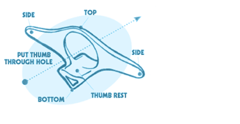
Hi, Please may we order another 200 thumbthings. Thanks.
Fraser Jansen, Methven's Booksellers Windsor
Labels: Design

Type in any address in the USA – and viola - it's home value is displayed for all the world to see. An amazing and somewhat creepy (in a stalker kind of way) concept.
Try it for yourself!

Don't get me wrong. A logo is an intregal part of your product or corporate identity. However for all that it "is" – some things it's "NOT."
Here's one person's take...
( via Mark Bixby ) Highly recommended.
Labels: Design

Plenty sites showcase logos. Some are cool. Some, not so hot. Then along comes LogoPond. A collection of user submitted logos that allow viewers to rate (on a five star system). Kinda demographic, right?
By the way. Don't rip off other people's logos. These sites are for reference only. But you knew that.
Labels: Design

An outstanding designer. Period.
Labels: Design, Design Firm, graphic designer, Rodrigo Corral

Here's yet another LuLu-like self publishing model. Since I work at a publishing company, and considering one of my best friends is an author relations director, I know first hand how unlikely it is to become a published author. Therefore I'm curious about these sites as an option to those with Oprah book deals on their minds. If you have experience with this site, LuLu or others, I would enjoy your comments.
As God would have it, my wife and I are currently sans-children. Should we ever realize such a blessing, I just might refer back to this resource.
It's written by Dr. Charles Burnette, and edited by Yi Ji Hyun, and is provided free to anyone interested in teaching children and young adults the creative and critical thinking skills they need to cope with any subject or situation.
Admittedly, I have absolutely no idea if Chuck is a wacko or not, but judging by the website, it appears this site is legit.
( via swissmiss )
Labels: Design, Design Related
Who comes to mind when you think someone who's always slightly ahead of the curve? With style. With information. For me, that person is Tina Roth Eisenberg. Not only is she a great designer, but she's also a new mom. She somehow manages to create and update my favorite blog everyday.
Props to swissmiss. The blog of a swiss designer gone NYC.
Labels: Design

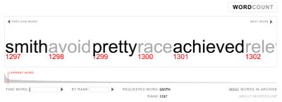
If you're a wordsmith like myself, you'll love this site.
A visual barometer presenting the 86,800+ most frequently used English words, ranked in order of commonness.
Many of you have seen or heard of Dave Werner. If you haven't, you're in for a treat.
Labels: book designer, Dave Werner, Okay Dave
I've found this to be of particular interest as the inlaws come marching in to town.
Gapers Block is a Chicago-centric web publication providing information on news and events around town. There are many terms for the slowdown in traffic that occurs when there's an accident on the side of the road. Some people call it rubbernecking, others a lookie-loo. Here in Chicago, we call it a gapers block (or gapers delay). What better name for a site that asks you to slow down and check out all the cool things in the city?
Labels: Chicago, Gapers Block, Resource, things to do, web publication

On vacation in Colorado, I stopped in the infamous Tattered Cover bookstore on Colfax Avenue. Inside I found a free standing floor display by Penguin Books. My attention was drawn to the incredible cover designs and their clean and highly simple typographic solutions. To make a long story short, the books are a rebranded Reference Library, and have sold well over a million at 3.99/each! Most are two color covers, but letterpress I believe.
I've since researched and discovered that Penguin's in-house designer designed a similar line called "Great Ideas," which was the precursor to these books. Penguin Claims...
I find the latter statement highly interesting.
“Some were bought by people who wanted accessible versions of the text, and some by people who liked the packaging.”
If you are interested in learning more, check out these articles...
Penguin uses design to revitalise its back catalogue with Great Ideas and a revived Reference Library
New ways to judge books by their covers
Great Ideas = great design
Labels: Colfax, Design, Penguin Books, Tattered Cover Bookstore