// BarryBlog //

A creative dumping ground for issues that interest me personally and professionally, with the thought they may interest you too. Issues such as the business of design, the design of business, the design of objects, design strategy, creative direction, innovation, creativity, thought leadership, observations, as well as recommendations, mid-century modern decorative arts and architecture, and the state of my thinking (and currently the state of my heart).

Tuesday, October 31, 2006

Darren Booth. Illustrator + Typographer.


I love
Darren Booth’s work. He’s an excellent illustrator, and he incorporates this skill into very unique illustrated typographical imagery. His work has personality and voice. He’s been featured in CommArts, Youngblood, and How Magazine. I want to figure out a way to work with him someday.

Labels:

Monday, October 30, 2006

The Big Buildings of Beijing


The upcoming Beijing Olympics has been the catalyst for some amazing architectural mega work-in-projects. From the likes of OMA; REM Koolhaus; Herzog & de Meuron; and PTW.

( via
anarchitecture )

Saturday, October 28, 2006

When They Zig...You ZAG!

Former Critique Magazine editor and author of Brand Gap—Marty Neumeier is at it again with what appears to be another can’t miss book on branding called ZAG. Marty’s two stated goals for writing the book are to make it easy and quick enough to digest on a brief plane trip, and to provide the insights, process and courage to build high-performance brands. Order it here.

( via DESIGN*NOTES )

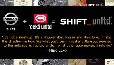
Sneaker Culture Elevated to Autos


I’m an admirer of Mark Ecko’s vision for design. He’s very intentional in his design thinking, and design execution, and his design continuity shows through his various product lines. Everything from his products to his hangtags to his advertising. Multi colors. Multi layers. Unique printing techniques. His work displays a true vision, and in the end, an authentic voice. Nissan apparently feels similarly. They’ve teamed up with the Ecko brand to create a Special Edition Nissan:Ecko Pathfinder. Very refreshing and encouraging to see automakers calling on different disciplines to add value to their product line and their thinking.

Friday, October 27, 2006

Use my images. What do I care?


The photos above are ones I took myself and have posted on Flickr. You have my permission to use them for commercial jobs or anything else. What do I care? They were just collecting digital dust. Also posted (larger) at sxc.

( slideshow via swissmiss )

Life In Vector

Brooke’s a commercial illustrator & graphic designer from Chicago who can draw like there’s no tomorrow. Be sure to mouse over the vector illustrations to see all the handy work that goes on under the hood.

FlickrStorm: Enhanced Flickr Search Engine

Better than a Flickr search alone, FlickrStorm works by searching for and around what you’re looking for to find other related images. Like other CreativeCommon search engines, FlickerStorm also has an advanced option to allow searches within specified Creative Commons licenses.

The photo in this post shows various images resulting from the search: “Mid-Century Modern.”

Wednesday, October 25, 2006

Heart of an Audi V8

This video shows how Audi truly understands the emotional connection good design has to it’s audience.

( via computerlove )

Tuesday, October 24, 2006

DesignChart: The Designer’s “Top 40”

Like a music Top 40, DesignCharts highlights the week’s design website Top 40 by order of traffic. These are the resources used to create DesignChart’s list.
designaside >< dopeawards >< iblog >< refreshlinks >< spyline >< websitedesignawards

I really enjoy this site, but to me searching the web can be compared to garage sales—sometimes the less trafficked one’s are where you find all the good stuff!

( via 30gms )

Monday, October 23, 2006

Photoshop Brushes


A plethora of PS Brushes, or as the site itself claims... “The Largest Photoshop Brush Resource Site on The Internet.”

( via WilliamAlexander )

Sunday, October 22, 2006

A Rare Sunday Post


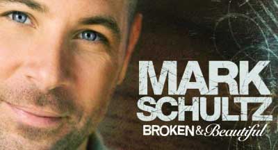
I’ve made it a point not to post on Sundays, however this post is truly an exception. Perhaps you’ll understand why as you watch Mark Schultz speak about his new song Broken and Beautiful— a tribute to his birth mother, who he has never met.

This video really drives home how courageous mothers are who give their babies up for adoption. Sounds crazy, right? Well, I’m learning that like most things which don’t make sense in this world, God has a plan for it all. And for us all. Especially if we listen.


My wife and I find ourselves spending another Sunday together waiting on God’s hand in our lives’ after 4 years trying to conceive and 4 years learning to seek His will and timing for us in these regards. Though she doesn’t know us, I thank Laura Christianson for her blog, and for her sharing this wonderful post.

Labels: , , ,

Saturday, October 21, 2006

Are You Beautiful?


The world sets an unrealistic standard on beauty. As a result, and to varying degrees, many women deal with low self esteem. Dove wishes to shed a more inclusive light on the definition of beauty, and has done so via the Dove Self Esteem Fund. Check out this video and see for yourself how the world’s perception of beauty is shaped in just one of many ways. Also, check out the Dove Global Study: the truth about beauty.

In my humble opinion, true beauty is better compared to a higher measure. A bar set by our Father in Heaven. In Psalms 139:14, we’re told we’re loved, and Fearfully and Wonderfully Made. I hope you feel this in your heart no matter what your weight, shape or complexion.


( via 30gms )

Friday, October 20, 2006

VSA: 2016 Chicago Olympic logo

VSA Partner’s probono work— The 2016 Chicago Olympic logo— is styled in the shape of a torch and consists of three distinct visual components. The flame, in the shape of Chicago’s skyline, reflects the international significance of Chicago architecture and speaks to the vitality of a city that rose from the ashes. The body of the torch merges a color palette that represents the blue of Lake Michigan with the vibrant green of the city’s park system — further underscoring Chicago’s commitment to the environment and sustainability. Together, these visual elements evoke the spirit of the Olympic Games and its values.

More about the effort.

( via brentter )

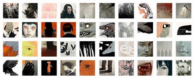
Illustrator Sam Weber


There’s something distinctive about this illustrator’s work that I can’t quite put my finger on. Is it the color palette? The technique? I’m not sure, but I see a lot of illustrators work, and this caught my attention. See what you think.

About Sam: Born in Alaska, Sam grew up in Deep River Ontario, Canada. After attending the Alberta College of Art and Design in Calgary, he moved to New York to pursue illustration and attend graduate school at The School of Visual Arts. In addition to drawing, Sam works part time as assistant art director of the OpEd page at the New York Times.
( via computerlove )

Creative Showcase for Design Students

5oup is a place for creative students to showcase their work to a wide audience.

( via designwire )

Wednesday, October 18, 2006

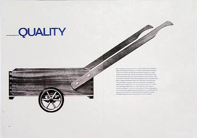
The genius of Ken Garland & Associates


From the website:
The choice of the trading name 'Ken Garland and Associates: Designers' was in order to signify that the outfit didn't consist merely of one designer plus odd helpers who knocked off paste-ups, took phone messages or ran errands. Those who worked with me between 1962 and 2002 have always been designers designing - no secretaries, no typists, no donkey- workers. There were never more than three of them at any one time. I intend no criticism of larger, probably more illustrious design groups when I say that, for me, an increase in size would have meant fruitless to-ing and fro-ing, more unexplained and unacceptable overheads, and less fun.

Read their Design Manifesto from 1964—slightly ahead of it’s time, right?!
( via AceJet 170 )

Tuesday, October 17, 2006

Web 2.0: Giving–vs–Taking

I’m amazed by how large a percentage of friends, family, and colleagues are utterly confused by my blog. I get emails, voicemails, blank stares, and am asked “what am I supposed to do at your blog?” And since all you can really do at any website is click stuff, that’s the advice I give. Everyone wants to know how I have time for adding stuff. They want to know how can I afford it. They ask what I get out of it. And ironically they are all too busy to read it.

So on the rare occasion someone does take an interest in blogging, I offer the
Web 2.0 “Give-vs-Take” model as an analogy.

...for the first time in history, the world’s most powerful form of media is about giving, not taking. The implications are vast.
( via gapingvoid )

Shirt Folding. (Yep, Shirt Folding).

That pile of shirts is calling out your name. Now get busy.

Monday, October 16, 2006

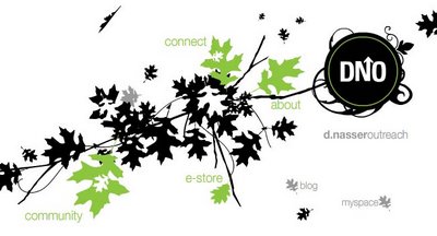
David Nasser Outreach Website


Part speaker, author, visionary and ALL minister, David Nasser’s greatest passion is to connect people to the living God. The site is really excellent, and is a result of a collaboration with AM Design.

David also has a blog.

( via DesignMeltDown )

Jewish + Christian History Timelines


Here is an incredible interactive timeline of Jewish and Christian History. And here is a static one.

Friday, October 13, 2006

Shameless Birthday Gift Suggestion


My birthday’s coming up on November 3rd. If 5 or 600 of you all pitch in a buck a piece, you could afford to buy me this most excellent chair.

Thank you in advance for your generosity.

( via Ludwig Mies Van Der Rohe )

Thursday, October 12, 2006

Hear,Hear: The Paul Buckley Interview

Published in two installments, Hear,Hear chats with Paul Buckley, a veteran art director of one of the largest book publishers in the world, The Penguin Group.

My official title is Vice President Executive Art Director, which should give you a clue that I’ve been here at Penguin Group awhile. They treat me pretty good, so I’ve stuck around. Basically, I wear two hats – I manage a large staff of very talented designers and art directors, and look over their shoulders when necessary and stay out of their way when necessary. While running my department, I try to be a Designer as well, working on my own covers and fulfilling my own artistic needs. The imprints within my department are all trade – Penguin / Viking / Penguin Press / Portfolio / Sentinel; so there is a really nice mix and always interesting projects to sink ones teeth into. —Paul Buckley

Here's a nice Flickr set of a visit to his studio.

( via Hear,Hear )

Being “Cheaper” Doesn’t Create Loyalty

Thoughts on being cheaper... according to the over-linked (but deservedly so) Seth Godin (of Purple Cow fame).

Note: I’ve avoided linking to SethBlog for the simple reason that EVERYONE else already does. But this article on price point in relationship to product brand really hits a sweet spot by me.


( via THE LATE Design View )

Wednesday, October 11, 2006

Tobias: The Peter Mendelsund Interview

Christopher Tobias at Outerwearforbooks has been eluding to this...and now it’s a reality...the interview with Knopf's Peter Mendelsund. As a veteran book designer himself, Tobias is uniquely qualified to ask Mendelsund the kinds of questions fellow designers will gobble right up. Things like struggles getting his work approved; too much author input; work you’re not particularly proud of; working with John Gall and Chip Kidd; how he got hired; project timeframes; trends; etc. Thank you Chris for your great blog and for this interview.

Labels:

Eames Office Films: Powers of Ten

DEAD: The Simpson's take and the original Eames film are no longer available.
- - - -
The relative size of the universe from a Chicago vantage point, brought to you by designers Ray and Charles Eames (and you thought great designers just make pretty pictures)!


And then the Simpsons take.

( via Land+Living )

Labels: , , , , , , ,

Eames Office Films: The Eames Chair

The making of the classic Eames Lounger Chair. I’ve always wanted one. This video makes me want one more. Click here to see video.
Note: The former YouTube link has been removed since this originally was posted.

Labels:

Tuesday, October 10, 2006

Fellow Computer Geeks— Somebody Pinch Me!


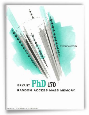
Get this. A collection of 250 vintage marketing brochures developed during the time when computers and science fiction were running neck and neck (and the guy in the cube next to you was smokin’ camel filters in each finger). Searchable by Company, Category, Application and Decade. And to top that off, they’re all available as PDF download. Now get at it! While you’re there, check out the Computer History Timeline.

( via BB-Blog > computerhistory.org )

Labels:

Set Your Seitz on This!


A 6x17 digital panorama shot (uncompressed) at about 950 MB. Granted—an amazing camera—but it would be hard not to laugh at someone using it.

( via BB-Blog )

Monday, October 09, 2006

Pando: Taking a Vegas guess

If I were a bettin’ man, I’d bet on Pando.


( via icreatethings )

Labels: ,

A Magazine. Worthwhile?


The people behind Worthwhile believe it’s impossible to have a meaningful life without meaningful work. So, they created the first media company for people seeking a more personally fulfilling and socially responsible route to business success.

“Just got my premiere issue of Worthwhile. Wow! … This mag, as much or more than Fast Company, is what I've been waiting for.”
- Tom Peters, business guru, Boston
Interestingly, I find the thing that makes my work worthwhile curiously missing from this magazine. Leave me a comment if I’m incorrect here.

( via B L A N K )

Friday, October 06, 2006

Russian Posters Galore


A nice Flickr set of Russian Posters.

( via designwire )

Labels:

Space Age Russian Architecture


Frederic Caubin, chief editor of French magazine, Citizen K, shows us photos of strange and wonderful buildings he's taken of Soviet architecture from the 70’s and 80’s. Beautiful, unique and slightly eerie. See if you agree.

( via )


Labels:

Thursday, October 05, 2006

A Designer's Research Manual

Looks like a must have, but I'm cheap—so let me know if you've read it. From Amazon... Doing research can make all the difference between great and good design...designers are able to bring something to the table that reflects a commercial value for the client beyond a well-crafted logo or brochure...research is the basis of all good design work...This book provides a comprehensive manual on what design research is, why, how to research, and how to apply it to design...share common vernacular with clients...The ability to execute effective research methods is as important to a career in graphic design as the ability to build a grid or layout a page...Understanding the needs of the client and the client’ market are essential components of creating value.

Labels:

Publishing: So What’s Next?


“Unquestionably hip and metropolitan... overnight, the company has transformed itself from an interesting start-up to a serious player and one that understands the rules of the game.”
I’m personally very intrigued by the digital on-demand printing model. As such, I’ve embarked on an experiment of publishing one of my previous design efforts into a variety of digital on-demand formats (and price points). I’m doing so in order to begin understanding this phenomenon first hand, from the user side, so I can learn and experience the nuances, vernacular and experience the end product. Upon completion, I intend to share what I’ve learned with colleagues in a larger, more comprehensive and ongoing conversation.

In the process of all this, I’ve identified a publisher who I have my eye on. They’re called “The Friday Project.” They’re not an on-demand model, but a completely new breed of publishing house, dedicated to combining everything that’s great about traditional book publishing with the limitless possibilities offered by the Internet and emerging technologies.


Though I can’t speak specifically to their business model and/or profitability, I do generally admire them for the uniqueness of their effort(s), and the foresight and fitness that must be required of such a venture. I will post more about digital on-demand printing in the future.

Wednesday, October 04, 2006

Junkyard Dog Trick No. 1: Resize Photos


You need to resize photos in a pinch, and you’re without Photoshop. This is a job for ResizR.

( via WholesomeGoodness )

Labels:

Candid Questions. They ask ’em, so you don't have to.


No matter who you are, there are undoubtedly questions about faith, God, and your position and place in life that you’ve thought of yourself and/or wanted to ask publicly. Well now you don’t have to! Though you may not agree with all the answers, you have to admit the discussions are very thoughtful, and are conducted without all the shouting and red faces you get in public debate. Questions such as... How can I be convinced I have heard the voice of God, so I can know his will for my life? Why did God allow the tsunami disaster? Why is there evil in the world if God is all-powerful? What About People Who Say God Talks to Them? I have been in constant pain for over 30 years and I suffer from major chronic depression. I have been a Christian most of my life. My life is anything but abundant. Why would a loving God allow his child to suffer so much?

Check it out.
Or, ask Ruth your own question!
Or, check out some other resources.

Likewise. I like.

A man comes across an ancient enemy, beaten and left for dead. He lifts the wounded man onto the back of a donkey and takes him to an inn to tend to the man’s recovery. Jesus tells this story and instructs those who are listening to go and do likewise.
Likewise books, a new imprint of Intervarsity Press, targeting 18-32 year old adults. When we’re skeptical about the status quo, Likewise books challenge us to create culture responsibly. When we’re confused about who we are and what we’re supposed to be doing, Likewise books help us listen for God’s voice. When we’re discouraged by the troubled world we’ve inherited, Likewise books help us hold onto hope. In this life we will face challenges that demand our response. Likewise books face those challenges with us so we can act on faith.

I’m enjoying what I see so far, including their new website which offers a free 90+ page Likewise Sampler as PDF. Thanks Likewise. May this new ministry effort give God all the glory.

( via cbaonline )

Monday, October 02, 2006

Innovation: The Power of Marginal


Let’s face it, not all that many people read this blog. But if you do, and you’re
interested in the subject of design innovation, this article is a needle in a haystack. One of the most intriguing bits of thinking on innovation I’ve ever read. Period.

( via ChangeThisNL )

Labels:

The Art of Versions: A Making of


Neil Ashby is an incredible designer and his work has inspired me over the years. As former VP Creative Director for the Recording Industry Association of America, Neil’s work is very visible. After a decade at RIAA, he’s gone on to amass a client list which includes nearly every notable recording studio and musician on the planet.

Neil and his friend Matthew Curry (imagefed) have collaborated on a 32-page booklet and package for Thievery Corporation’s CD entitled “Art of Versions” that shows the metamorphosis of a caterpillar into a fairy nymph. In developing this project, they collected 100’s of individual illustration “parts,” then mixed those with drawings they’d done by hand.

Broken into 4 categories—Intro, Pieces, Package and Store—
this site gives glimpse into this gorgeous effort.

( via NetDiver )

Labels: , , , , , , , , , , ,

“Look At Me, I’m a Designer”


Frank at B L A N K gets it. His design serves it’s purpose, and he knows who he serves. In his article, “Design Not Known,” he tells it like it is...

Design is all about others, not us. Design is a servant, not the star. Design is outward focused, not inward. So, to all those designers who no one knows or will ever know; who are slogging it out in the trenches day in and day out serving others without a note of “look at what I've done” fanfare being played: I salute you. Keep going. Resist the urge to jump onto the “try to get myself noticed” wagon. And keep serving others because ultimately, it is Him who you serve.

The complete article can be found here.

( via Blank )

Labels:

Newer Posts Older Posts